
Case 04 / 08 · SER-USA LLC
SER-USA Identity
A new name and a new identity for an industrial representative that had outgrown its old logo — built to stand next to the manufacturers it represents.
- Client
- SER-USA LLC
- Services
- Visual identity, brand applications
- Market
- LATAM
- Year
- 2021
01The challenge
A logo that no longer fit.
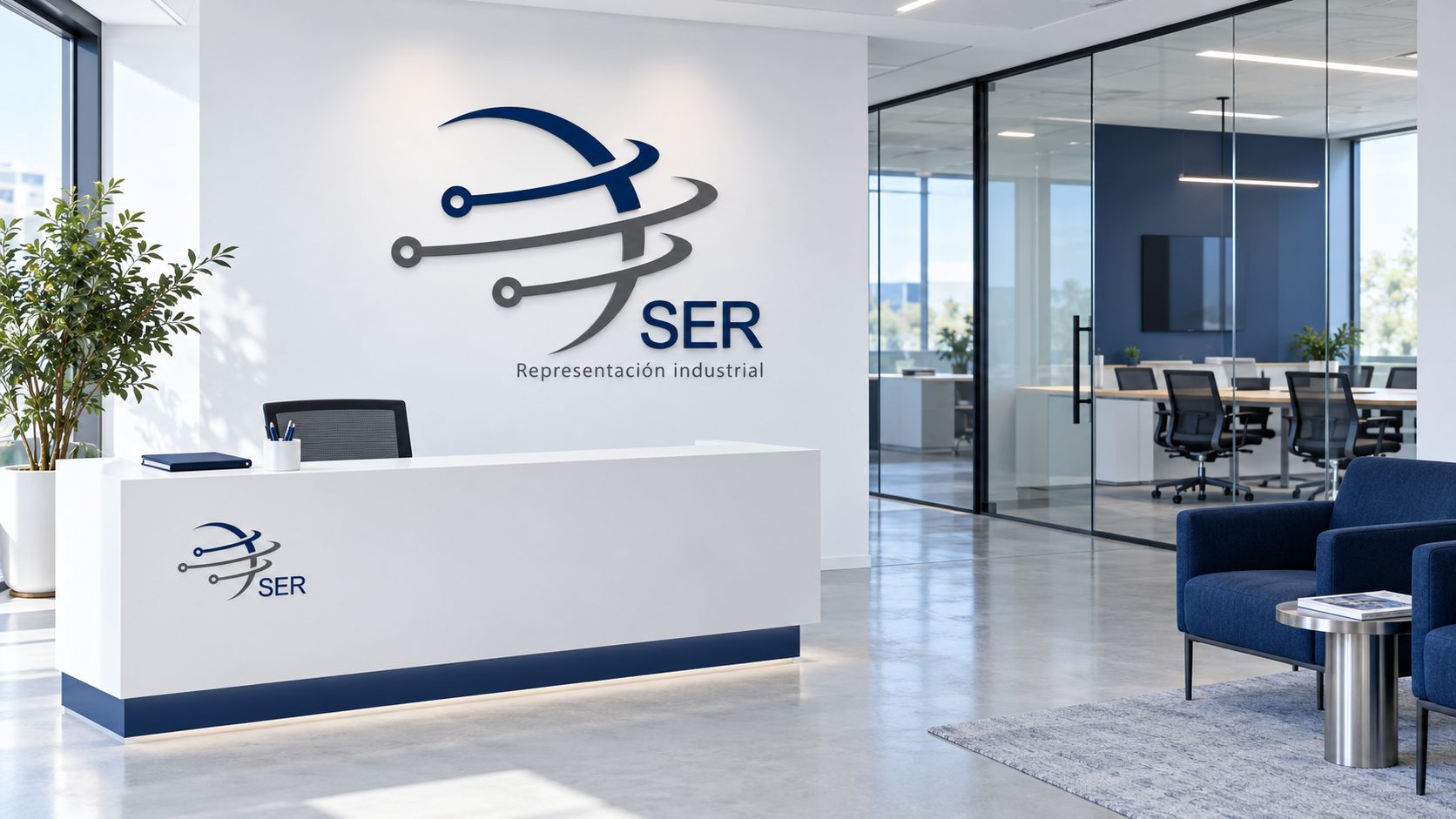
SER-USA represents American and European industrial manufacturers across Latin America. The company was changing its name, and the logo it had no longer represented who they were — it didn't look like a partner that brands like Federal Signal or Littelfuse would trust with a whole region.
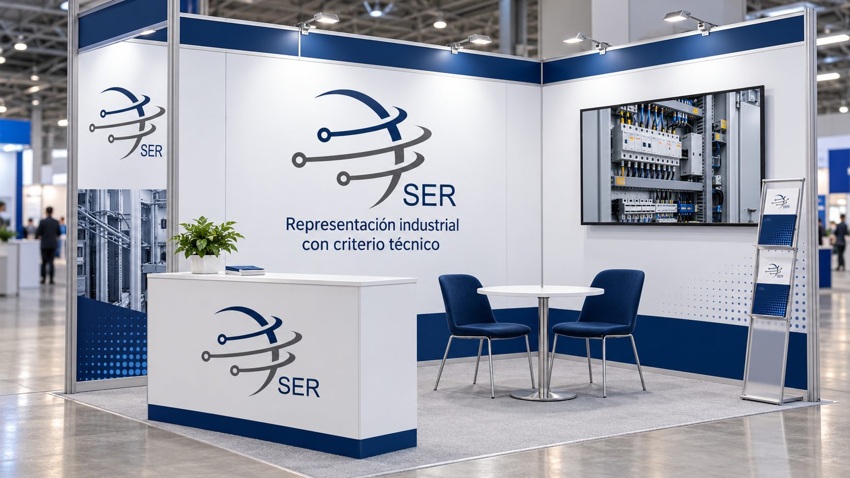
The new identity had to work in a world of trade-show booths, hard hats and technical datasheets, and sit next to the manufacturers' own logos without competing with them.
02The approach
A mark built for reach.
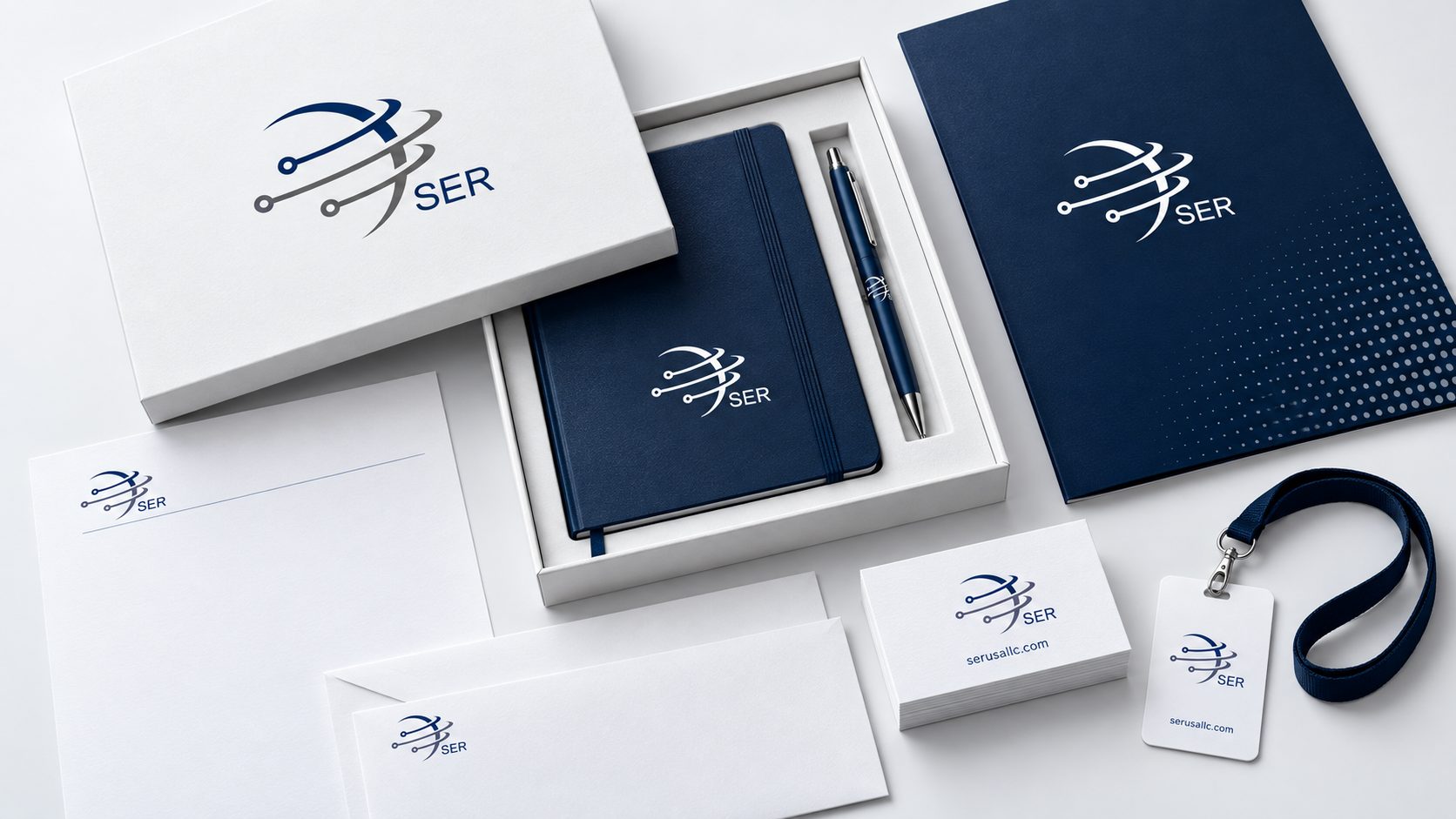
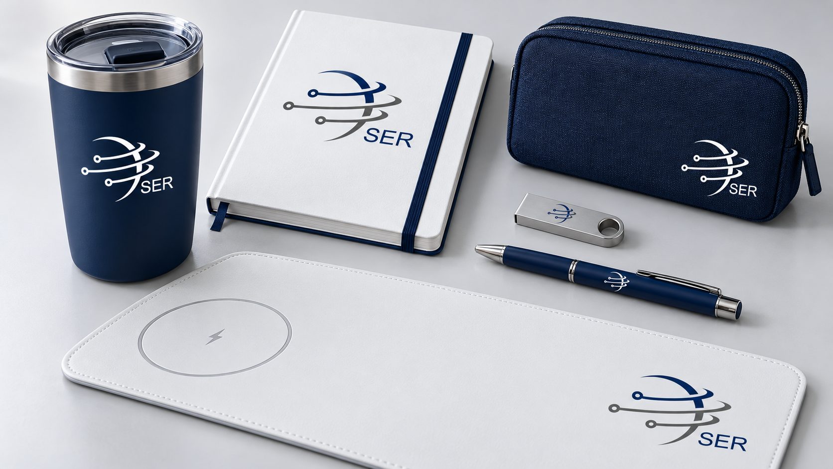
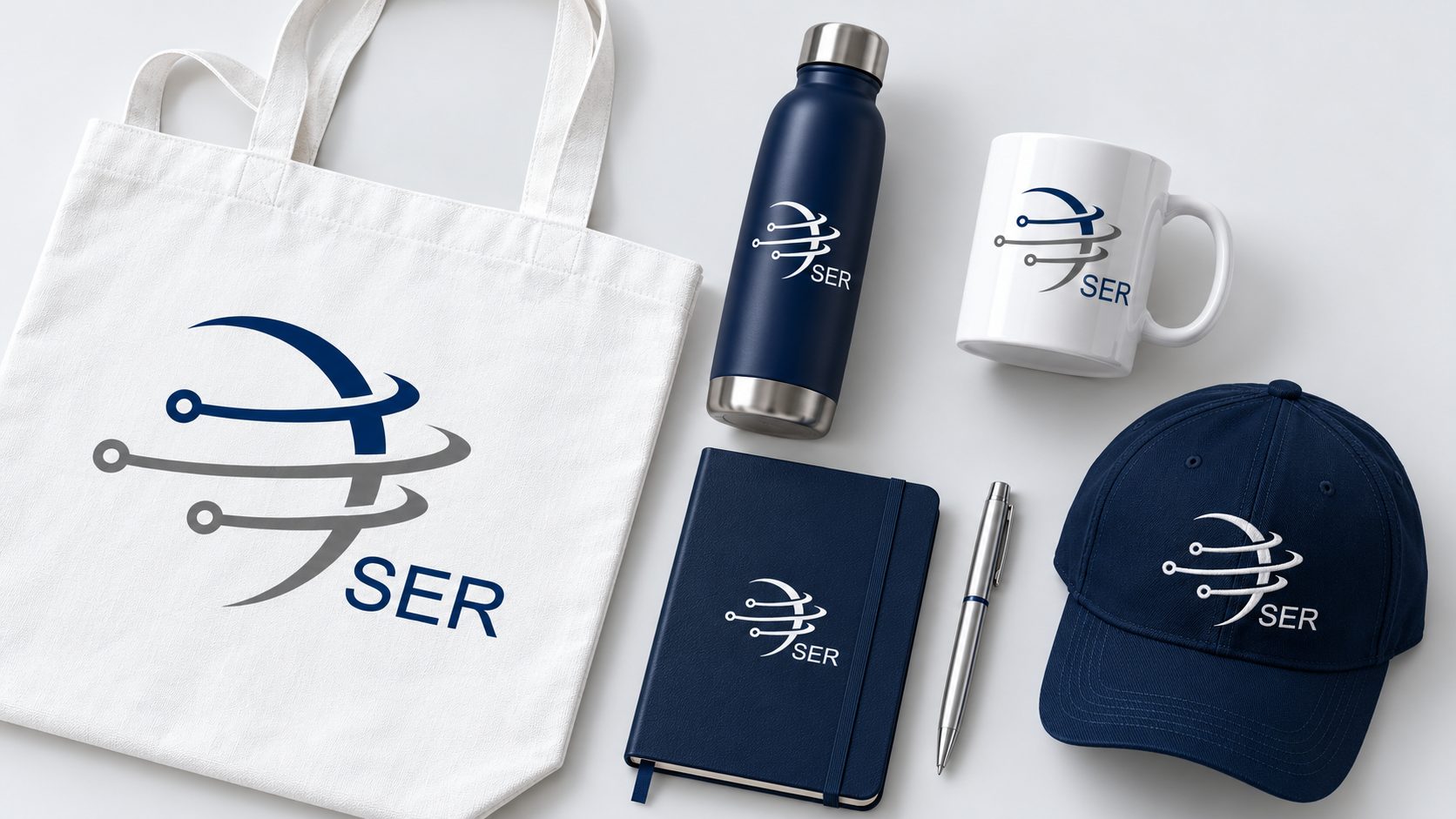
The mark pairs an orbit with connection nodes — a company whose job is to link manufacturers with a region — next to a clean SER wordmark and the line “Representación industrial”. A restrained navy and grey palette keeps it technical and lets it sit quietly beside the brands they carry.
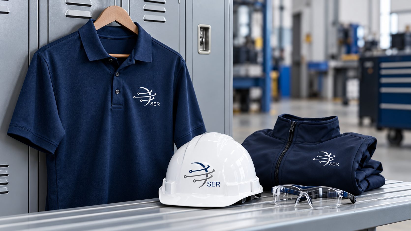
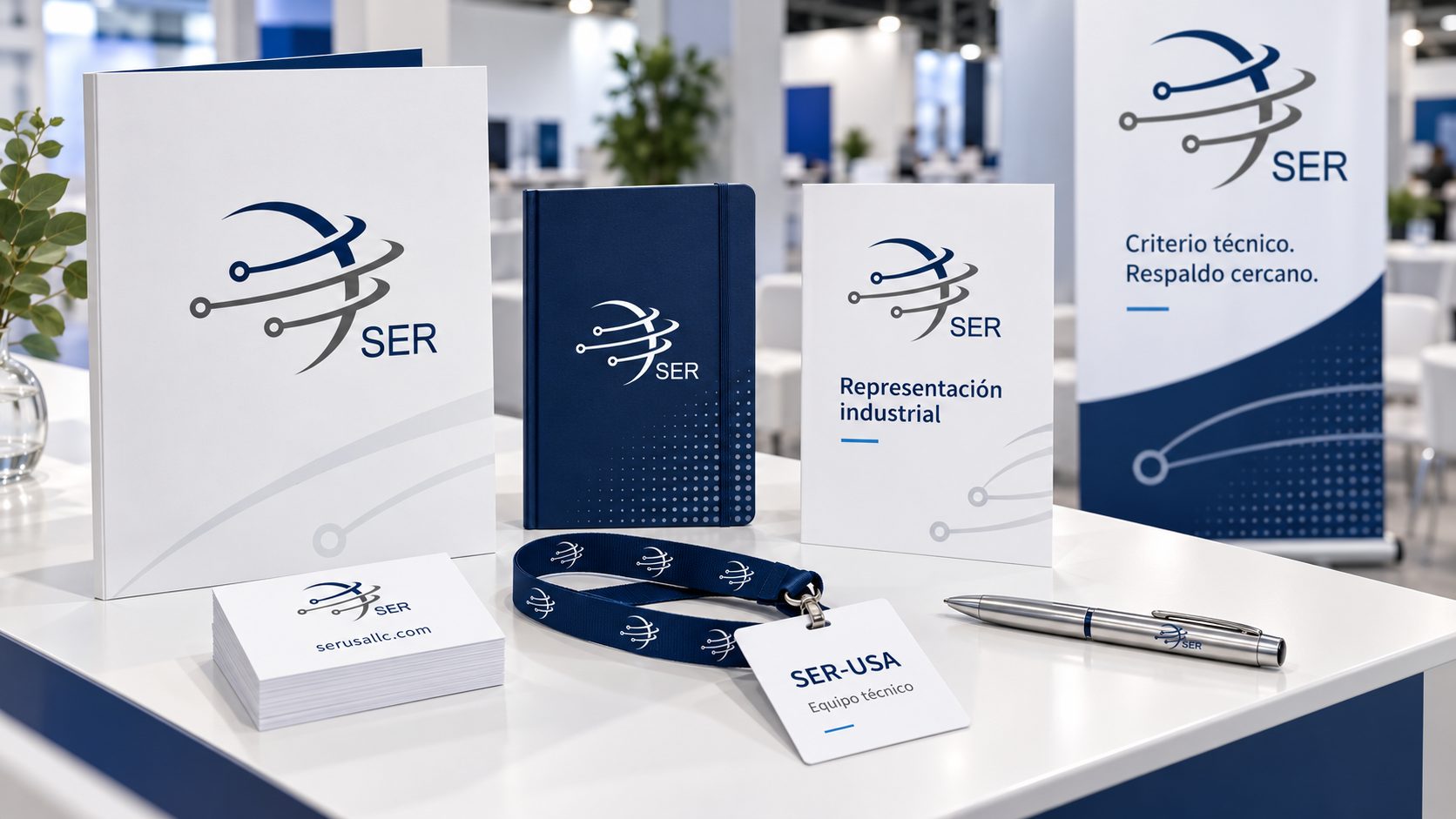
I built the identity to live where the company actually works: stationery and welcome kits for clients, uniforms and safety gear for the field team, promotional pieces, and a booth system for the industry fairs where they meet buyers.
03The result
An identity that travels with the team.
Next project