
Case 05 / 08 · Dear Routine
Dear Routine
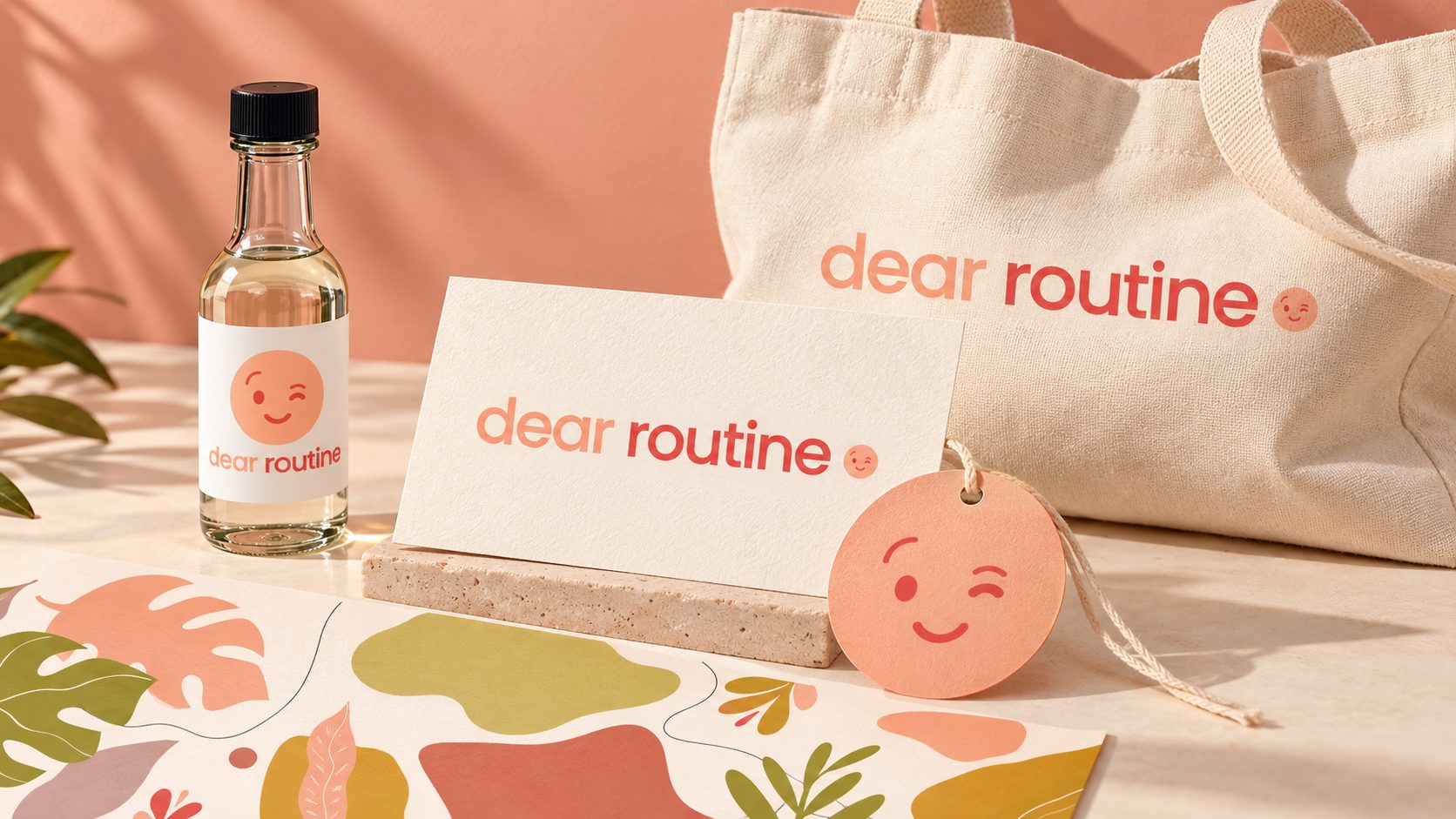
Six handmade self-care products that looked like six different makers — turned into one line a small team can extend without a designer.
- Client
- Dear Routine
- Services
- Visual identity, packaging design
- Market
- USA
- Year
- 2019
01The challenge
Six products, six different brands.
A small handmade brand with real products and real customers, but no identity and no consistent packaging. Every item looked like it came from a different maker, which cost them the one thing a handmade brand actually sells on: looking considered.
The system also had to be usable by a team with no designer — anything that needed me to apply it would drift the moment they launched a new product.
02The approach
One layout, six products.
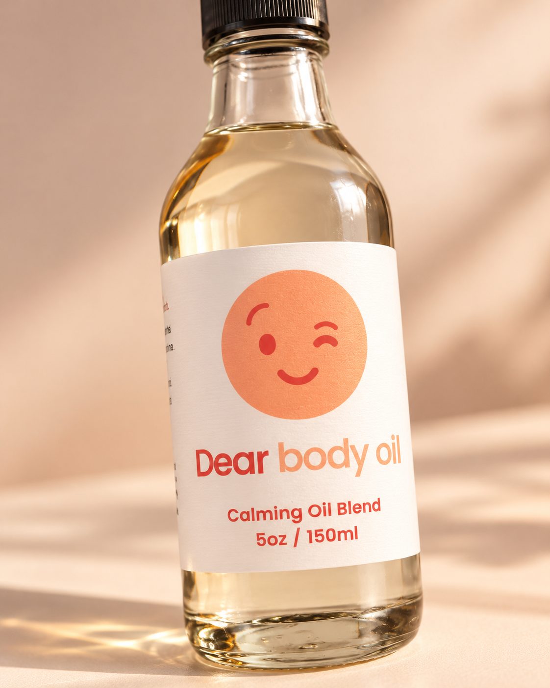
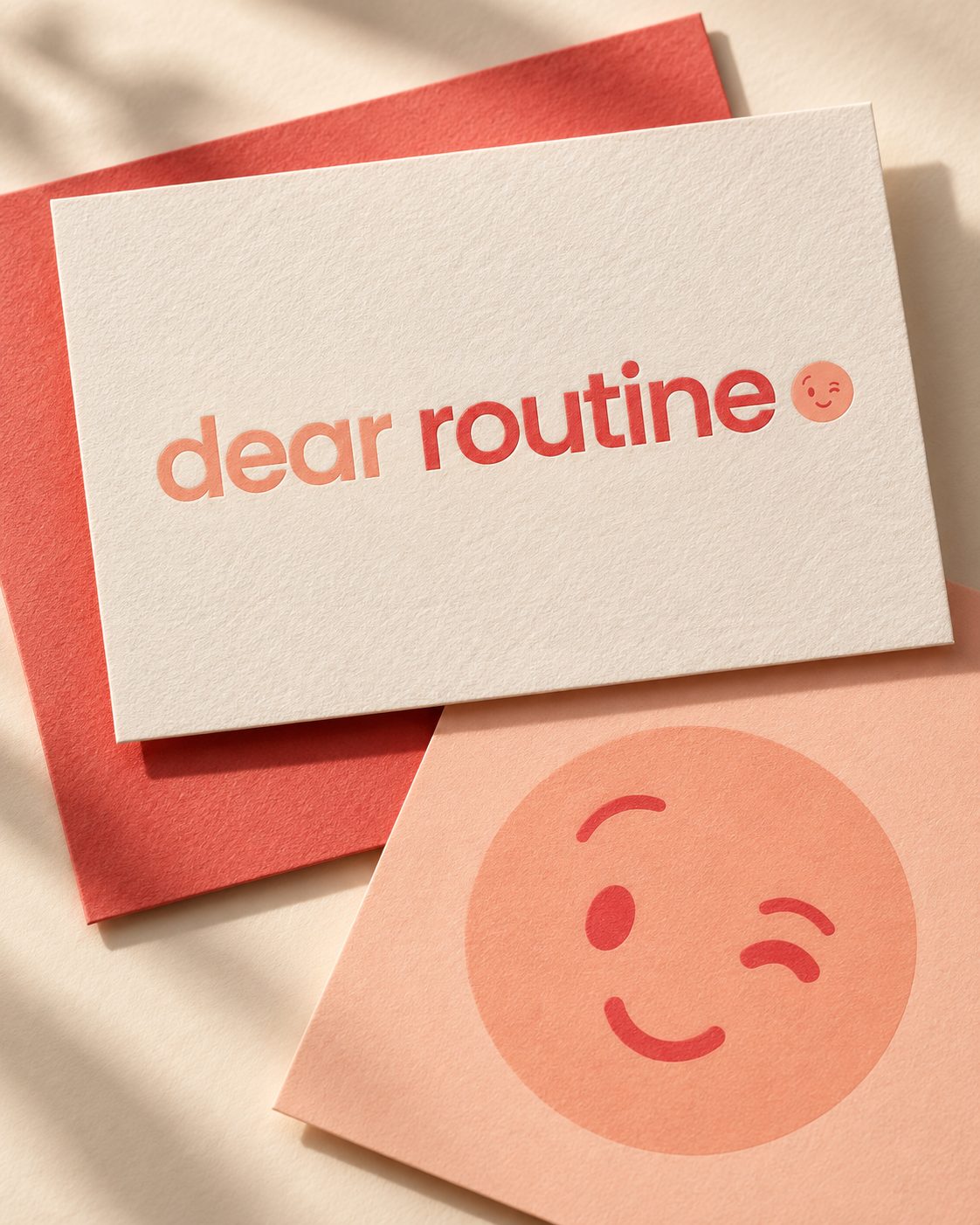
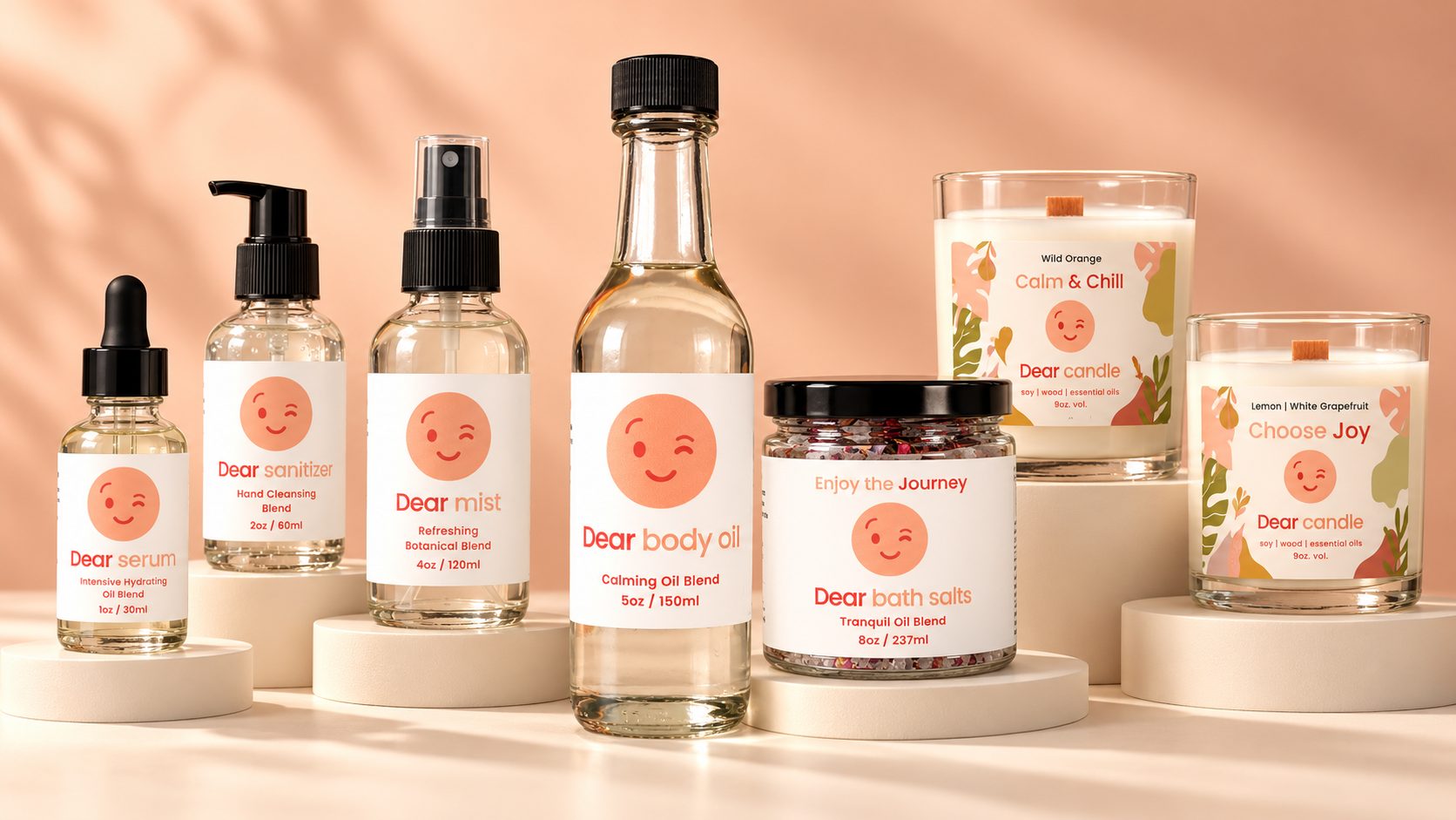
Handmade is the selling point, so the work had to look considered without looking mass-produced. I built the identity — logo, palette, typography, graphic elements and usage rules — around a single flexible layout that a small team can apply to a new product on their own.
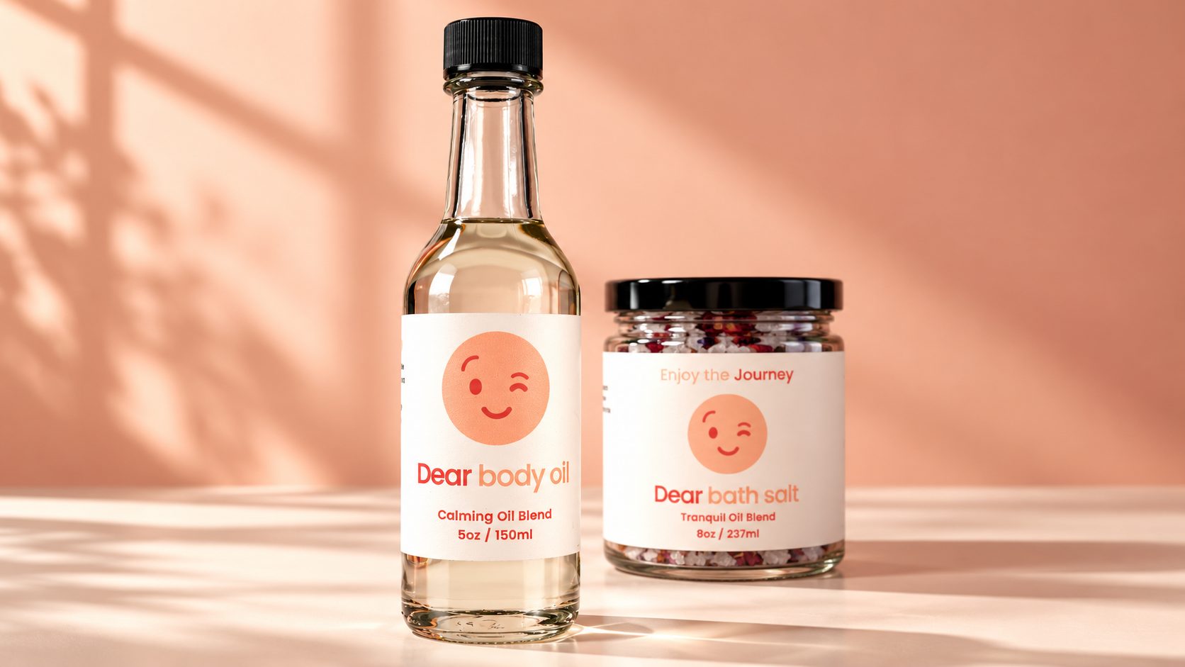
The client had already named every product “Dear” plus what it is — Dear body oil, Dear bath salts, Dear candle. I built the system to carry that idea: the same winking face, the same warm palette and the same layout on every label, so only the product name changes. That is what turns six separate items into a line a customer recognizes on a market table or in a photo on a phone. The client and I worked as a team throughout, which is why the system stayed intact instead of drifting product by product.
03The result
One line, not six products.
Next project