
Case 07 / 08 · MONAT
The IR Supplement
A hair supplement relaunched with a new name, a new formula and, for the first time, a box — bottle and carton designed from zero.
- Client
- MONAT
- Services
- Packaging design, bottle + carton, dielines
- Market
- US, Canada, ANZ & APAC
- Year
- 2024 — 2025
01The challenge
A bottle that didn't read.
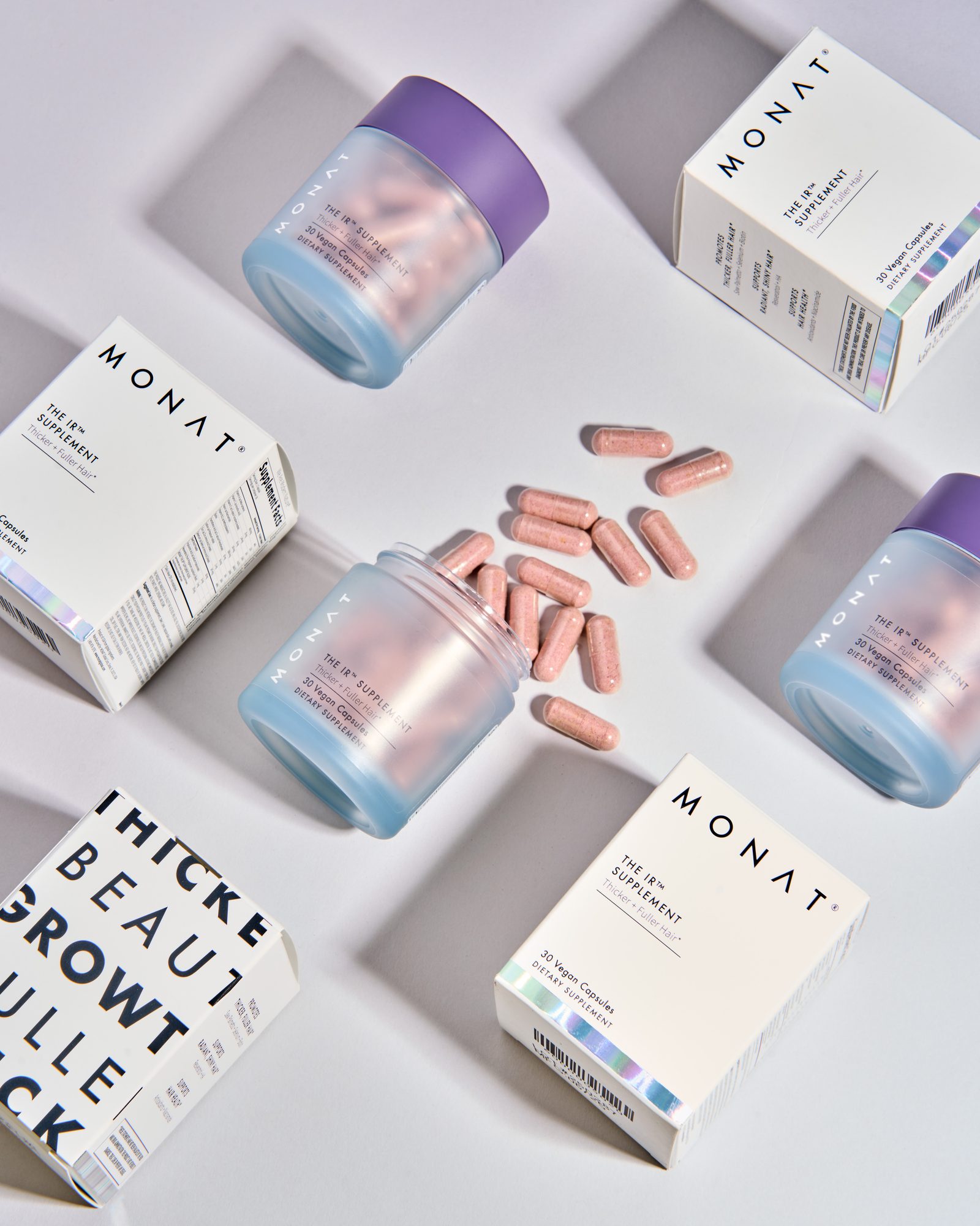
The supplement was being relaunched with a new name and a reformulated ingredient list. The existing bottle wasn't doing its one job: on a shelf or on a screen, it was hard to tell what the product was and what it was for.
There was also no box. Name, benefits, ingredients and regulatory copy all had to share one small label — which is exactly why nothing on it stood out.
02The approach
Give the promise a box.
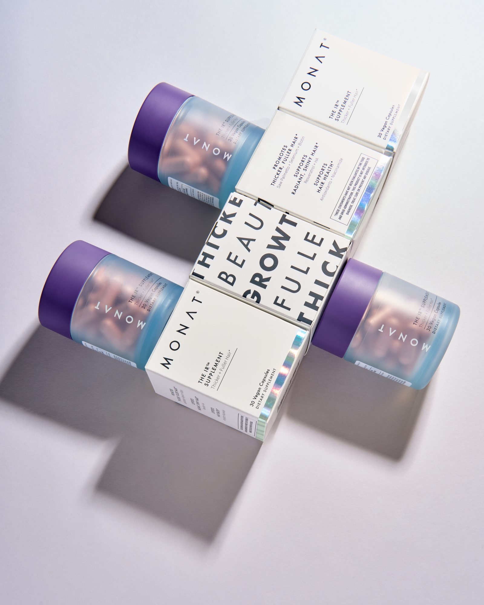
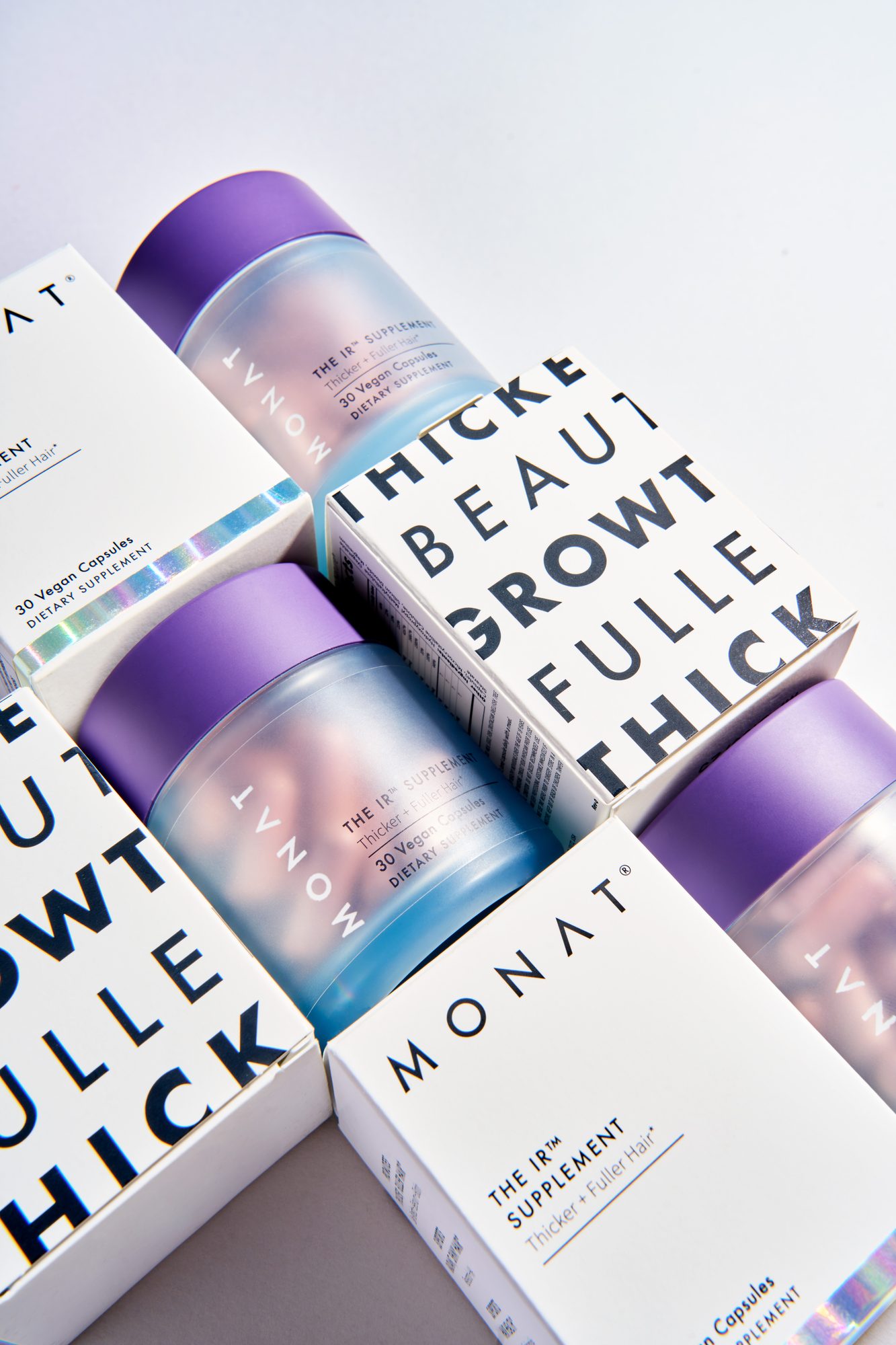
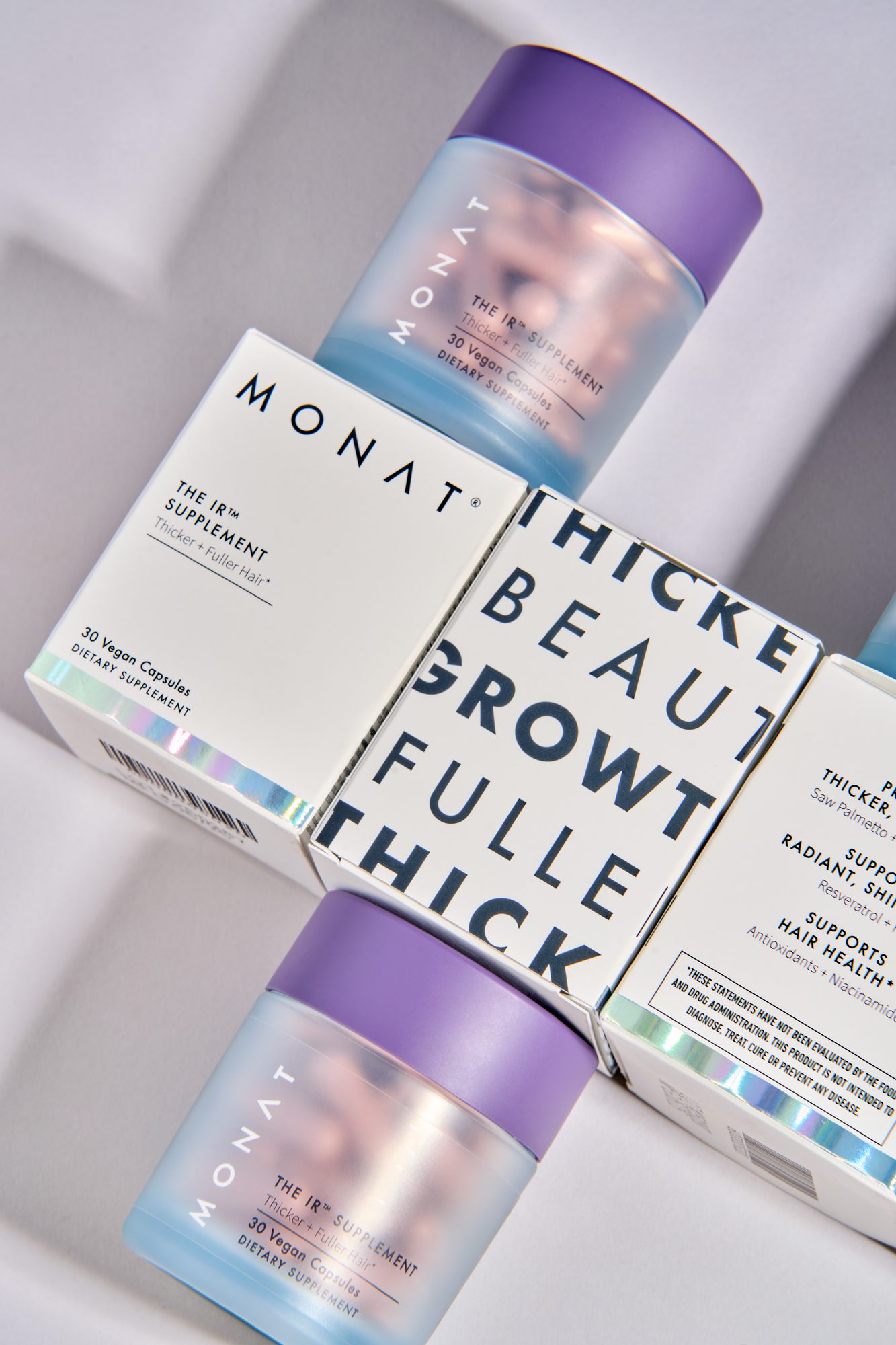
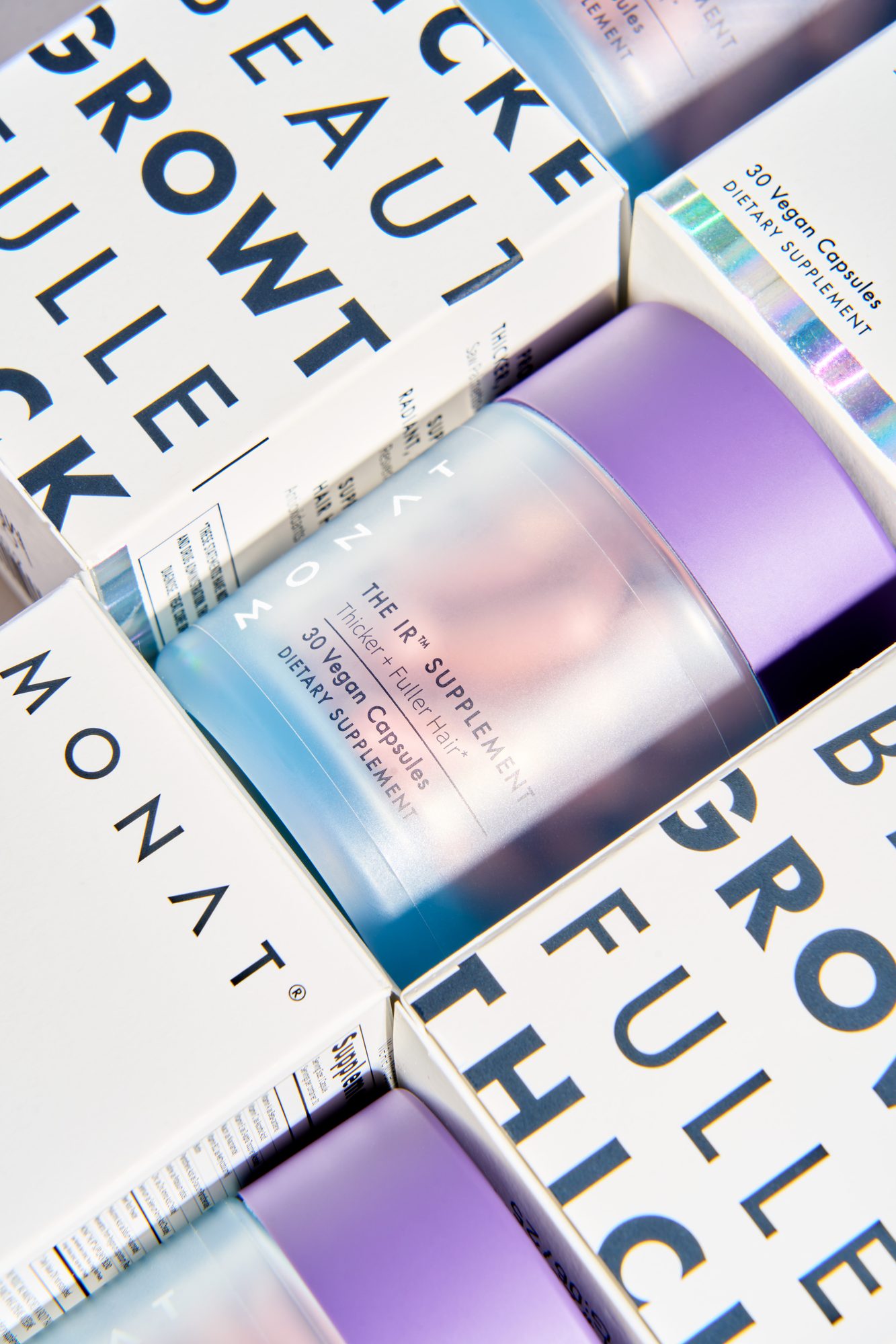
I designed both pieces from scratch and split the work between them. The bottle stays clean — frosted body, violet cap, the MONAT wordmark and the new name — because it is the object a customer keeps on the counter.
The carton carries the promise. The benefits — thicker, fuller, growth, beauty — run as oversized type around the panels, so the box reads from across a room and in a thumbnail before anyone gets to the fine print. Ingredients and regulatory copy moved to the sides and back, where they finally have room.
03The result
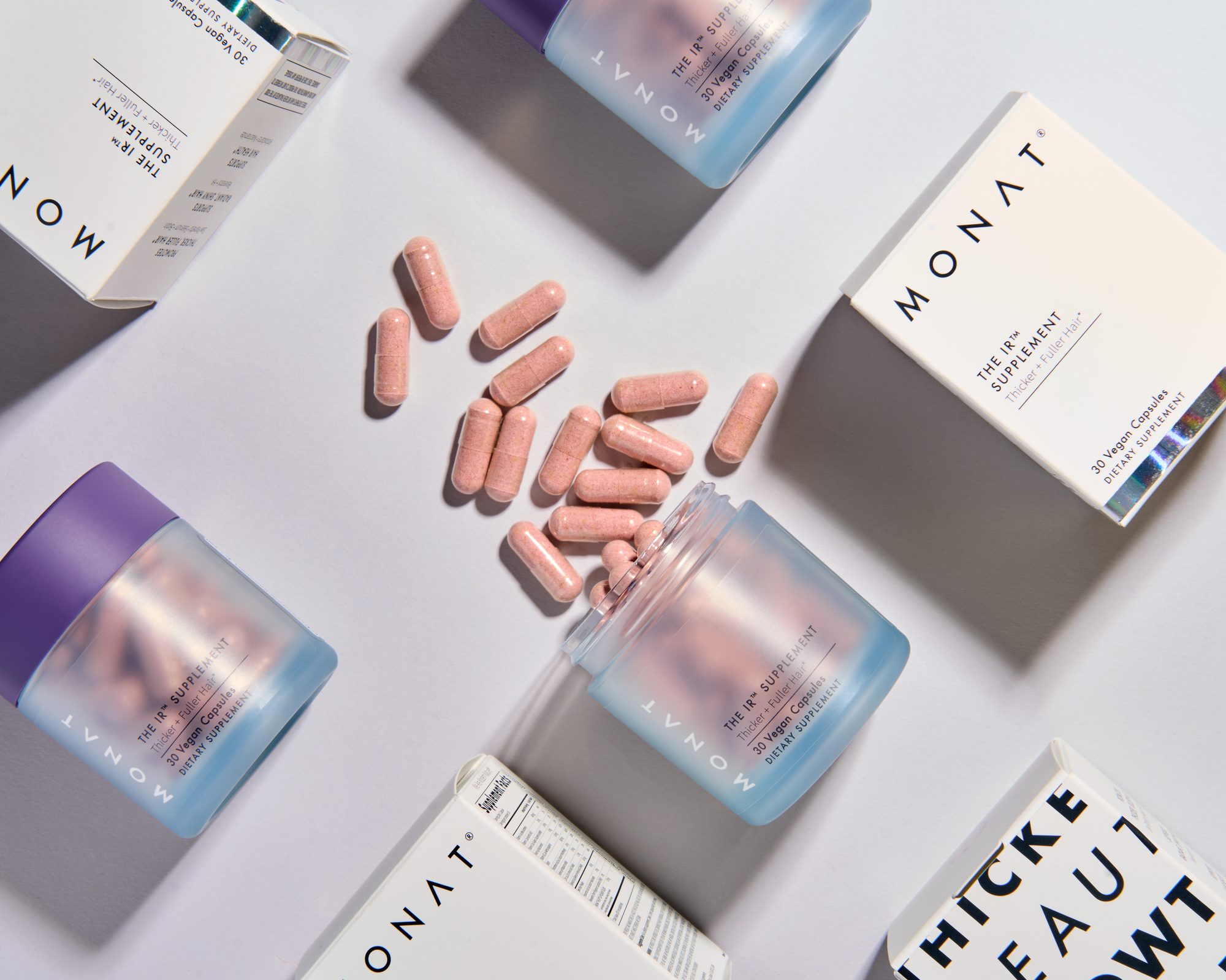
A supplement you can read at a glance.
Next project